
Page 24 - MSDN Magazine, October 2017
P. 24
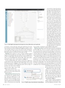
Figure 4 The Flight Delay Experiment Opened in Azure Machine Learning Studio
sets needs to be cleaned in order to be merged and analyzed by the ML algorithm. Notice that in the steps attached to the Weather data set, there’s even a module that executes R code. Select the Execute R Script module and, as before, right mouse click on the 1. The context menu has a Visualize option, yet it’s grayed out, as is every other option. This means that the experiment hasn’t been run. On the lower portion of the screen, click the Run button and choose Run to run the experiment. In a few moments, the experiment will finish. Depending on server load, this experiment may take longer when using the free service. Now click on the Execute R Script and right-click the 1. The visualiza- tion dialog appears displaying the output of the module. In fact, now that the entire experiment has run, every module’s data can be visual- ized. Exploring the modules and visualizing the data at each step, you can track the data transformations throughout the process. However,
size button, a zoom to fit button and a pan toggle button. You may have already noticed that clicking and dragging around the canvas selects modules and does not move the canvas around. Clicking the pan toggle button will toggle the mode from selecting to panning. When pan mode is activated, the button appears blue.
Modules The workspace canvas contains modules linked together. Each module represents either a data set, manipulation of data or an algorithm. To get an idea of the contents of the source data set, select the Flight Delays Data module, right-click on the 1, and click Visualize on the context menu (see Figure 5).
In the resulting dialog, the contents of the data set appear in a grid. Click on one of the fields and expand the Statistics and Visualization panels. In Figure 6, the Carrier field is chosen and between the Statistics and Visualization panel, the basic shape of the data can be discovered. Click the
X in the upper-right corner of the
dialog to close out this view.
some modules’ visualizations appear different than others. Machine Learning As mentioned previously, this experiment classifies flights into one of two categories: delayed or not delayed. The experiment first cleans the data and shapes the data into a format and structure with which an ML algorithm can work. Data scientists often refer to this process as “data wrangling” and it can represent the majority of effort in any kind of data science project. Generally speaking, the process of an ML experiment once the data has been shaped and cleaned follows the following steps: split the data into a test set and training set, pick an algorithm to exam- ine the data, and score the results. This experiment runs the data through two algorithms: Two-Class Boosted Decision Tree and Two-Class Logistic Regression. Each algorithm processes the data in different ways. Certain algorithms are better at certain data sets and problems than others. This is where the experimentation comes into play. When there’s more than one algo- rithm in an experiment, then the models can be evaluated against one another with an Evaluate Model mod- ule. Select the Evaluate Model module, right-click on 1 and select Visualize in the context menu. The dialog will look
Repeat the previous steps to visu- alize the structure and content of the Weather Dataset.
Manipulating the Raw Data Sets
Note that there are a number of mod- ules making modifications to the data in the data set and there are two branches: one for the Flight Delays data set and the other for the Weather data set. The data in each of the data
Figure 5 Flight Delays Data Module Context Menu
something like Figure 7.
The Evaluate Model visualization
dialog contains vital information to understanding the performance of the
20 msdn magazine
Artificially Intelligent
