
Page 28 - spaces4learning, Fall 2024
P. 28
s p a c e s 4 l e a rn i n g
WALLS, CEILINGS & FLOORS
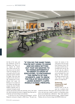
the blue of the water, and
the well-known rust-red of
Oklahoma clay. These col-
ors inspired the school’s
color scheme and were fur-
ther woven into the school’s
culture by assigning one to
each grade: green for sixth,
orange for seventh, and blue
for eighth. They were then
worked into the school’s de-
sign through paint accents,
artwork and carpet tile
flooring to act as visual cues
for students and help them
navigate the school. Further
biophilic elements were in-
corporated through natural
textures and patterns within the materials, such as the carpet
tile, which mimicked the look of a dappled forest floor and art-
work that used natural shapes and materials.
“It tells this nice story of growth and development,” said Ian
Kilpatrick, lead project designer at DLR Group. “The green rep-
28 FALL 2024 | spaces4learning.com
“IF YOU DO THE SAME THING,
YOU’RE NOT GOING TO GROW.
AND WE KNEW SETTING
OUT THAT WE WANTED TO
DO THINGS DIFFERENTLY
IN ORDER TO GROW AS
EDUCATORS, TO ENCOURAGE
THE GROWTH OF OUR
STUDENTS, AND TO GROW
THE FIELD OF EDUCATION.”
AMES BURNETT, CAPPS
MIDDLE SCHOOL PRINCIPAL
resents the newness of the
sixth grade as they move away
from elementary school. The
red-orange stands for the sur-
rounding forest and the clay
the roots dig into, reflective
of the continued growth of
each seventh-grade class. And
finally, the blue represents
the flowing movement of the
creek, ready to carry eighth
graders on to high school.”
Fostering
Community and
Connection
Another tenant of the de-
sign was to promote more
student-led education. This meant that learning would be more
active, and more space would be needed to accommodate group
projects and multiple-class collaboration. “They really wanted to
get rid of that ‘front-of-the-classroom model,’” explained Angela
Clarkson, director of interior design with LWPB Architecture.
