Page 14 - spaces4learning, January/February 2020
P. 14
spaces4learning HIGHER ED FEATURE
to integrate building and site, which began by retaining a grove of mature white oak trees. “It’s the idea of moving through the forest and arriv- ing at a cabin in the woods,” Baribeau says of the design concept. “We saw an opportunity to really weave the landscape through the form of the building so they became one entity.”
Created as part of the design collaborative’s broader master plan for the southwestern corner of campus, the residence hall takes a serpentine form, broken down into five interconnected segments. “It allowed all the spaces, from dorm rooms to public spaces, to have great proximity to natural light,” explains Chung.
The integration of building and landscape ties to a broader sus- tainable design strategy that is expected to earn Adohi Hall LEED certification with the U.S. Green Building Council. A partial green roof and ground-based landscape features help filter rainwa- ter. A highly efficient building envelope and mechanical system mean that the project is estimated to be 30 to 40 percent more energy efficient than a structure designed to code. An energy- recovery wheel, for example, captures heat from return-air and uses it to heat ventilated incoming fresh air. Even the warm water from showers is being harnessed as it goes down the drain, thanks to copper coils that capture heat for use in warming additional water.
All About Community
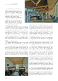
The building’s metal-clad upper floors, devoted to living spaces, sit above glass-clad communal spaces on the ground floor that come in a variety of sizes and atmospheres.
The northernmost point features a key entry known as the “front porch.” The central ground-floor passage’s midpoint com- prises a main gathering area known as the “cabin” that includes a community kitchen, lounges and a quiet hearth area. The lower courtyard contains a series of creative studio and rehearsal spaces for performing arts and music students. “These spaces are different sizes and draw different personalities,” explains Mackey Mitchell Architects Principal Kyle Wagner. “Some people like to be in the
biggest, loudest room. Other people want to curl up in a corner by the fire. But they’re still doing it in a public area so they have the opportunity to mingle and meet new people. That change in scale gives flexibility, but it also caters to a variety of personalities.”
Having a variety of types of public spaces in which to work and play is also reflective of how the American workplace has changed, the students’ next step. “I think you see it in large companies and small,” Johnson says. “People want places to see and be seen and feel connected, but they also want enough pri- vacy to get their work done.”
Adohi Hall offers a mix of room types, all designed around the idea of student interaction. “We used to see universities put- ting students in suites and apartments, because that’s what they were demanding, but they weren’t making as many friends,” Wagner adds. “At Adohi, it was a priority to promote a strong sense of community and places to interact. It’s a residence hall, so it’s mostly bedrooms and units, but the unit mix is important.”
One popular unit arrangement, known as a pod, places four to six dual-occupancy rooms around a shared living area. There is also a separate lounge on each floor. “This is the mixing area where people can start to get to know each other,” Wagner ex- plains. “We purposely put it near the stair and elevator, where people are standing and moving every day. We’re not thinking about Adohi as just a dorm or as a place to sleep. We’re trying to understand how it impacts the entire student experience. It builds exponentially: first you meet your roommate, then the people who live close to you, then your floor, then the other floor.”
Ultimately, student life is about change, yet Adohi Hall stands to be a continuing attractor for the university’s students, not only because it gives residents plenty of space to live, work and play, but also for its appealing atmosphere that makes a bold sustainable statement, bettering the planet as a result. “When we take people on tours, you can see people touching, feeling and even smelling the wood,” Leers adds. “It appeals to all the senses.”
And best of all, the building is a hit with students. “The wood provides a much different environment when you walk into the building,” says Johnson. “Students enjoy the ambiance.”
Brian Libby is a design and arts writer living in Portland, OR, who has contributed to the New York Times, the Wall Street Jour- nal, Architectural Digest and The Atlantic, among other publica- tions.
14 JAN/FEB 2020


