
Page 20 - MSDN Magazine, June 2019
P. 20
since 2004 and have kept basic statistics on how frequently I posted each month. Additionally, I have added the number of days in each month and the average post per day value (PPD). PPD is the number of posts in a given month divided by the number of days inthatmonth.IhaveplacedtheCSVfileintheprojectlibraryon the Azure Notebook Service at bit.ly/2V76d2G.
Enter the following code into a new cell to load the data into an R data frame, a tabular data structure with columns for variables and rows for observations, and display the first six and the last three records using the head and tail functions, respectively, like so:
postData <- read.csv(file="franksworldposts.csv", header=TRUE, sep=",") head(postData)
tail(postData, 3)
Using the str function, I can view the basic structure and data types of the DataFrame. Enter the following code into a new cell:
str(postData)
The output should reveal that the DataFrame has 183 obser- vations, or rows, and consists of four variables, or columns. The Posts and Days.in.Month variables are integers, while the PPD is a numeric type. The Month variable is a factor with 183 levels, where factor is a data type that corresponds to categorical variables in statistics. Factors are the functional equivalent to categorical in Python Pandas and can be either strings or integers. They’re ideal for variables with a limited number of unique values, or, in R terms, levels. In this DataFrame, the Month field represents a month between February 2004 and April 2019. As dates do not repeat, there are no duplicate categorical values.
Now that my data is loaded, I can sort and query it to explore it further. Perhaps I can glean some insights. For instance, if I wanted to view the top-10 months where I was most productive on my blog, I could perform a descending sort on the Posts column. To do so, enter the following code into a new cell and execute it:
sortedPostData <- postData[order(-postData$Posts),] head(sortedPostData, 10)
The top-10 most active months have all been within the last three years. To explore the data set further, I can perform a filtering opera- tion to determine which months have had 100 or more posts. In R, the subset function does just that. Enter the following code to apply this filter and assign the output to a new DataFrame called over100, like so:
over100 <- subset(postData, subset = Posts >= 100) over100
The results look similar to the previous output of the top 10. To check the count of rows, use the nrow function to count the num- ber of rows in the DataFrame, like this:
nrow(over100)
The output indicates that there are 11 rows where there were 100 or more blog posts in a given month. With 100 posts, May 2005 just missed the top-10 most active months, falling into 11th place. Clearing the 100-posts-per-month threshold wasn’t a milestone I would reach again for 11 years. Is there a pattern of starting the blog with intensity only to have it fade out and then pick it up again? Let’s examine the data further.
Now would be a good time to explore how to view individual rows and columns in a DataFrame. For example, to view the first row in the DataFrame, enter the following code to view the con- tents of the entire row:
postData[1,]
Note that the index for the DataFrame starts at 1 and not 0, as in most other programming languages. To view just the Posts field for the first row, enter the following code:
postData[1,2]
ToviewallthevaluesinthePostsfield,usethefollowinglineofcode:
postData[,2]
Alternatively, you may also use the following syntax to display the columns based on their name. Enter the following line of code and confirm that its output matches the output from the line prior:
postData$Posts
As R has its roots in statistical processing, there are many built in functions to view the basic shape and properties of the data. Use the following code to get a better understanding of the data in the Post column:
mean(postData$Posts) max(postData$Posts) min(postData$Posts) summary(postData$Posts)
Now, compare this to the PPD column, like so:
mean(postData$PPD) max(postData$PPD) min(postData$PPD) summary(postData$PPD)
From the data we see that the number of posts vary from one per month all the way to 225 over the course of 15 years. What if I wanted to explore only the first year? Enter the following code to display only the records for the first year of blogging, along with statistical summaries for the Post and PPD fields:
postData[1:12,] summary(postData[1:12,2]) # Posts summary(postData[1:12,4]) # PPD
While the numbers here tell a story, very often a graph will reveal more about trends and patterns. Fortunately, R has rich graph plot- ting capabilities built in. Let’s explore those.
Visualizing Data
Creating plots in R is very simple and can be done with a single line of code. Let’s start by using the post counts and PPD values for the first year. Here’s the code to do that:
plot(postData[1:12,2], xlab="Month Index", ylab="Posts", main="Posts in the 1st Year")
plot(postData[1:12,4], xlab="Month Index", ylab="PPD", main="PPD in the 1st Year")
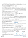
The output should resemble Figure 1.
For the first year of blogging, the graph shows that post activity steadily grew the first year with a steep growth curve between the third and sixth months. After a late summer dip, 2004 finished up strong. Additionally, the graphs reveal that there’s high correla- tion between the number of posts in a month and the number of posts per day. While this may be intuitive, it’s interesting to see it displayed in graph form.
Posts in the First Year
2 4 6 8 10 12 Month Index
PPD in the First Year
2 4 6 8 10 12 Month Index
16 msdn magazine
Artificially Intelligent
Figure 1 Plotting the Posts and PPD Columns
Posts
20 40 60
PPD 0.5 1.5
