
Page 51 - MSDN Magazine, March 2019
P. 51
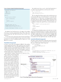
Figure 2 Source Code of the Modal Component
The ModalContext class is used to collect the ID and the Bool- ean value for the closing button, as shown in the code here:
public class ModalContext {
public string Id { get; set; }
public bool AutoClose { get; set; } }
The CascadingValue element captures the provided expression and automatically shares it with all innermost components that explicitly bind to it. Without the cascading parameters feature, any shared value in complex and hierarchical components must be explicitly injected wherever needed. Without this feature, you would have to indicate the same ID twice, as shown in this code:
<Modal>
<Toggle id="myModal" class="btn btn-primary btn-lg">
...
</Toggle>
<Content id="myModal">
... </Content>
</Modal>
Cascading values are helpful in situations where the same set of values must be passed along the hierarchy of a complex component made of multiple sub-components. Note that cascading values must be grouped in a single container; therefore, if you need to pass on multiple scalar values, you should first define a container object. Figure 3 illustrates how parameters flow through the hierarchy of modal components.
Inside the Modal Component
The inner content of the Modal component is parsed recursively, and the Toggle and Content components take care of that. Here’s the source of the Toggle.cshtml component:
<button class="@Class" data-toggle="modal"
data-target="#@OutermostEnv.Id"> @ChildContent
</button>
@functions {
<CascadingValue Value="@Context"> <div>
@ChildContent </div>
</CascadingValue>
@functions {
protected override void OnInit() {
Context = new ModalContext {
Id = Id,
AutoClose = AutoClose };
}
ModalContext Context { get; set; }
[Parameter] private string Id { get; set; } [Parameter] private bool AutoClose { get; set; }
[Parameter] RenderFragment ChildContent { get; set; } }
In summary, based on the previous code snippet, the resulting UI is made of a primary button labeled “Open.” Once clicked, the button will pop up a DIV filled with three layers: header, body and footer.
To create the nested components required for the modal dialog box, you need to deal with templated components and cascading parameters. Note that cascading parameters require you to run Blazor 0.7.0 or newer.
The Modal Component
Let’s have a look at the code displayed in Figure 2. The markup is fairly minimal and includes a DIV element around a chunk of templated markup. The modal.cshtml file in Figure 2 declares a template property named ChildContent that collects (obviously enough) any child content. The result of the markup is to push out a surrounding DIV element that gathers both the toggle markup and the actual content to display in the dialog.
Apparently this container component is not of great use. None- theless, it plays a crucial role given the
required structure of the markup for
Bootstrap dialog boxes. Both the Tog-
[CascadingParameter] protected ModalContext OutermostEnv { get; set; } [Parameter] string Class { get; set; }
[Parameter] RenderFragment ChildContent { get; set; }
}
gle and Content components share the same ID that uniquely identifies the modal dialog. By using a wrapper com- ponent, you can capture the ID value in only one place and cascade it down the tree. In this particular case, though, the ID is not even the sole param- eter you want to cascade through the innermost layers of markup. A modal dialog can optionally have a Close button in the header, as well as other attributes related to the size of the dialog or the animation. All of this information can be grouped together in a custom data transfer object and cascaded through the tree. msdnmagazine.com
Figure 3 Cascading Values in Hierarchical Components
March 2019 45
