
Page 10 - Mobility Management, April 2018
P. 10
mm beat
NSM Launches Rebrand
where they deserve to go.”
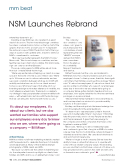
Creating a new NSM logo also resulted in a great
deal of discussion. The two-tone blue image combines two ideas: a wheelchair in motion on the top half of the graphic that also forms a lower-case “n” to represent the national scope of NSM. The bottom half of the logo depicts a person with uplifted arms, meant to reinforce NSM’s commitment to customers.
“Our new logo better represents the NSM of today.” Mixon said. “We chose to keep our core blue, and we feel the new logo is fresh and scalable. This brand rede- sign can carry us another 20 years.”
Those upcoming years for NSM will be about more than just complex rehab technology.
“We’re very excited about helping our clients in a new space in the world of home access,” Mixon said. “We’re up to 18 home access locations nationwide, and we see a real correlation between what we do in CRT with mobility and what we can do for our clients around home access. What you’ll see is that while all of our branding redesign work makes reference to mobility, we don’t reference wheelchairs. The brand is scalable to our strategy to help people better achieve mobility both ways — with wheelchairs, but also with the technology that we can bring into the home with home access.”
It’s about our employees, it’s about our clients, but we also wanted our families who support our employees every day to know who we are, where we’re going as a company — Bill Mixon
A New Energy
NSM has rolled out all-new marketing materials created with the new brand to celebrate the impact of mobility and independence. Many of the materials feature photography of NSM clients and ATPs.
“Because our clients are the center of everything we do, it made perfect sense to spotlight our clients, their families and ATPs and focus on telling their stories,” said
10 APRIL2018|MOBILITYMANAGEMENT
Buckley.
The company
also created a “core values coin” given to each employee. The coin features a heart, representing the new “HEARTS” acronym derived from NSM’s new core values: Honor, Excellence, Accountability, Respect, Teamwork and Service.
Rather than bulk mail the coins and materials to
NSM branches, the company mailed a parcel to each employee’s home “so their spouses, their kids, their signi - cant others, their families would see this package,” Mixon said. “It’s about our employees, it’s about our clients, but we also wanted our families who support our employees every day to know who we are, where we’re going as
a company. We’ve gotten fantastic feedback from our employees, who appreciated the fact that we sent these packages on a personal level.
“We want their family members to know what they do, and how important our mission is to provide mobility solutions to those in need.”
Buckley said the work put into the brand redesign has paid off, judging from the early feedback.
“It’s been nice to see employees’ pride in the work we put in to better re ect them,” she noted. “I think they take this personally, and so do we. People are excited, and they’re renewed. It gives them new energy for
the company and all the companies that have come together to make up NSM.”
Mixon said, “We’re up to almost 1,600 employees and continue to grow. Part of my job as CEO is to make sure we have the most outstanding culture and keep it oriented around the client. We care about what we do and work hard at it every day.
“We’re no longer a small company. But we have the ability to have a culture that allows us to operate with some of those smaller-company values. This branding process and the tools that have come out of it allow us to stay grounded and focused on the client and will carry us forward as we continue to grow.” m
— Laurie Watanabe
MobilityMgmt.com
