Page 16 - CARAHSOFT, May/June 2020
P. 16
Digital Experience
Executive Viewpoint
A conversation with
CHARLES WORTHINGTON
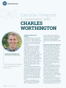
CHARLES WORTHINGTON
CTO, Department of Veterans Affairs
This conversation is adapted from a presentation at an FCW event.
Soliciting feedback from veterans
Ten million unique users per month visit
a VA website. The online component of citizen experience, which is what I’m most passionate about, is a huge opportunity for agencies like the VA to make a good impression.
When I joined the agency in 2017, we asked ourselves: How are we doing for these 10 million people? We talked to 5,000 veterans, service members and family members, and through a series
of qualitative and quantitative research studies, we asked them how we were doing.
We learned that we were doing OK,
but there were three consistent points of criticism. One, it was too hard to find what they were looking for on a VA website. Two, they felt our websites were disjointed and hard to navigate. And three, they
were frustrated that they had to work to navigate the VA.
Decision-making is usually delegated down to the program level, and as a result, we had built up a fragmented ecosystem. This is really confusing for people. They don’t think of the VA as a collection of brands. They think of the VA as a single entity, and so it’s very frustrating when they talk to one part of the VA but that part can’t help them with another part of the VA.
This is also confusing for Google, which is maybe an even bigger problem. If you’ve got 10 different versions of
the same content on your website and somebody Googles how to apply for your benefit, they’re going to get 10 different results that all have slightly different content delivered with a different look and feel.
Agreeing on North Star objectives
Another consistent piece of feedback we got from veterans was that there was one place they would expect to find what they were looking for, and that was VA.gov.
Before November 2018, VA.gov looked like many other agency websites. There was a lot of information, but it was not designed for the user. Very few of the 10 million people who visit a VA website
are looking for the fiscal 2019 budget submission, but too many federal websites have a lot of information that is more about the agency than about the services the agency provides.
We had a lot of stakeholders who were experts at delivering their benefit lines, so it was important to get everyone on the same page. The first thing we did was commit to some North Star objectives before we got down to the nitty-gritty about what’s going to be on the homepage, what brand it’s going to look like, and who we are redirecting and when.
Our first goal was to increase the use of our self-service tools. The second was to decrease the time that users spend waiting for an outcome from the VA. The first and second go hand in hand because in a lot
16 SPONSORED CONTENT


